Face work and troubles

I began going into further depth with animating my characters. I moved the head of my main male character into Adobe Character Animator and started playing around with all the features of the face.

https://www.youtube.com/watch?v=tUKfAJgtpfE

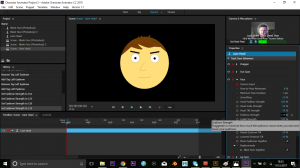
As shown above, I go through the layers of my Illustrator file, showing how they are laid out and that some have “+” symbols before each layer name. This is to let Character Animator know that this layer will move independently when you move the file from Illustrator across. Additionally, I point out how each layer is labelled in Character Animator through the use of the face model shown in the bottom right corner of the screen. All the features that I need to use work, although need some tweaking so that they don’t overlap or malfunction when it comes to the recording process.

Moving on from this, I decided to create a walk cycle for my characters to demonstrate that I could animate them within the scene. I attempted to follow a few different tutorials, however, I could not actually create a walk cycle or even animate my character models within After Effects like I had planned, due to system bugs.

At the start of each tutorial (like the one shown above), they explain specifically how to move your files and import them into After Effects from Illustrator. However, although I followed these steps and tried alternative methods, After Effects would just open the wrong file every time I attempted it. (Shown in the video below).

https://www.youtube.com/watch?v=UkpGIF6U5r8

No matter how many times I tried to remedy this problem, After Effects would always open the ball file, and I have no idea as to why it is doing so. This problem continues, not only with the walk cycle and animating characters, but with my scene that I had previously designed (every time I attempted to open the file it would open the ball). However I was able to tackle this problem with my scene. I followed a different tutorial on YouTube that discusses animating scenes within After Effects.

This tutorial shows the same method of importing an Illustrator file into After Effects, so that After Effects keeps all the same layers that you created in your original file (so that you can model and animate them individually). Although because of the issue I was having in which I could only import the ball file into After Effects, I could not do this. On the other hand, I was able to import the scene as a still image as one layer. Because of this I decided to keep the still image and edit on top of that, to make it look like a moving piece, rather than a still image.

https://www.youtube.com/watch?v=GiYofx1faww

This is what I managed to create as the “scene of natural beauty” that I had previously mentioned would be the main point of my piece. I added a few new cloud shapes that are animated to move across the screen, along with a shooting star effect I created using the in-built effect CC Particle World in After Effects, which I then played around with the settings to create the star effect. I also slightly increased the scale of the image over time to give the effect of camera movement on the piece. Finally I added the most complicated part of the edit. I created a new layer and added “Turbulent Noise” which I then played with the setting of to give a wiggling effect. I then also added “Curves” and made it so that the entire scene was dark except for all the brightest stars and the moon. Following this I set this layer to Luma Matte the original layer so that the Turbulent Noise would only effect the lightest parts of the curves effect I added on. And from this, I managed to create a twinkling effect on the stars and an animation on the moon, which makes it look like it’s giving off light.

From this process of creating an animated short, I have never encountered as many technical issues as I have whilst trying to create a concept. Moreover, I did not leave myself with a lot of time to create  2D concept, as most of my time was spent looking into 3D work, which I later discovered was too big of a project to take on in the amount of time I was given. Although I was not able to show that I could properly animate my 2D models and create a short animation because of it. I have shown that I have the ability to model 2D characters and scenes in which I have shown I can animate every part that my software would allow me to. However due to the late change from 3D to 2D animation, I was not able to properly troubleshoot my technical issues and create a fully working animation, however I feel like I have shown that I am able to create such a piece.
Face work and troubles

2D Progression

Moving on from creating my characters, I decided to start designing scenes for my animation. I watched a YouTube tutorial prior to creating my designs, so I could get a rough idea of how everything would work.

Star work

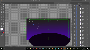
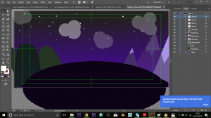
I began by creating the sky of the design using the gradient tool to get a night sky look in the background. I originally attempted to follow a tutorial to find an easy and efficient way to make stars, however the brushes I needed were not in-built into Adobe Illustrator and I didn’t have the money in order to purchase new brushes. Therefore I set about making many different elipse shapes and altered their position, scale and opacity to vary them in the sky.

Progress of scene

I also added different features such as hills. mountains and clouds into the scene so that it was not so plain. I later add shadows and darken certain colours dependent on where the light would be coming from within the scene.

2D Progression

Starting 2D work

I originally planned to create my 2D characters in Photoshop, but after looking at a few different tutorials, it made much more sense to develop my skills in Adobe Illustrator and create my characters and vectors for every moving piece within my concept. Additionally, Illustrator seems to be a lot easier to work with than Photoshop for the style of thing I intend to create.

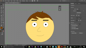
I began by following a short tutorial on making your first character in Character Animator (as I still intend to use this for my piece) to get to grips with the work flow I would need to undertake to get my characters working in the correct way. I began by creating a basic looking face and adding small features like hair and detail (whilst also following my original character sketches).

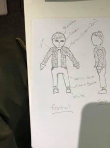
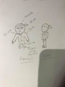
face creation detail ill Rough Design - Boy


I then moved the illustrated head into Character Animator to get to grips with how you tell the software how to match up every feature of the characters face with your own face on the webcam (by using the in-built tools in Character Animator and renaming different layers of the file in Adobe Illustrator). I just got to grips with the basics such as moving the eyebrows of my male character.

face creation cc eyebrows


Although the above picture isn’t the clearest, you can see that the eyebrows of my male character are differently shaped to the normal image, based off of what the camera sees me do in the top corner of the screen.

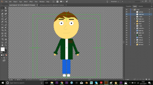
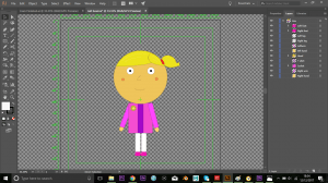
I then moved onto creating the rest of the body for my character and added details onto his clothing, whilst also creating the little sister character as well (again following my original idea from the rough sketches, but also altering their appearances slightly to look a bit more appealing than I originally planned).

Full body maleFull body female


Rough Design - Girl

I added some different detail to the male characters jacket than in my original sketch, as I felt that a tartan shirt wouldn’t give the correct impression of him. And I decided to add little rosy cheeks onto the girls face, along with a small flower on her jacket to reinforce the idea of sweet and innocent. Although these aren’t huge changes, I feel like they give a different feel to the characters than when I first pictured them.

Finally, I have began making certain vectors that will be added and animated within the scene. Just simple things like a ball that the little girl will play with which will entice her older brother the play with her (as the story is told in my first blog post).

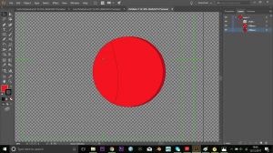
Ball design


I added a shadow to one side of the ball to give it a 3D look to it; to enhance it’s appearance when it is being animated in the scene. And just a simple curved line to reinforce that 3D look on the ball. I noticed little details like this while I was watching through previously created concepts to help gain inspiration for my concept, and although they aren’t huge details, they really give a little extra something to every moving piece within an animation.

Starting 2D work

Changing Plan

After a lot of trial and error with Blender, I was unable to create the 3D characters that I wanted. For some reason whenever I attempted to follow a different tutorial, the software would just not respond on my PC as it did on the tutorial. In addition to this, after discussing many variables with my tutors, we came to an agreement that I would develop a 2D animation rather than 3D, as a 3D animation would be too big of a project in a short period of time that I have left to complete my concept.

I looked into various different styles of 2D animation that have already been created. A lot of the very detailed concepts seemed like they would be too big of a project for me to take on in a short period of time and didn’t really appeal to the sort of style I would want to create for a 2D piece anyway. I looked into the work of a YouTuber named “PsychicPebbles”, who creates a lot of animations with dark humour, but the style in which they are designed seems to suit what I like – not too much detail within the characters, but fairly detailed settings in which the story plays out in. This suits my story idea because the whole idea would revolve around the scene of natural beauty in which the two main characters have revelation in a picturesque setting. I also looked into a piece created by “The CGBros” on YouTube which doesn’t have very detailed characters, but appealing settings, which I feel would be a good example.

Another inspiration I am going to take is from a basic tutorial that show the basics of animating a 2D animation in After Effects. The style seems to be simple but effective and pleasant on the eye.


Changing Plan

Tutorials

I have looked into a few different tutorials so far for my work. The first was posted in a previous post surrounding the 3D modelling of my characters for my short film. Another is one that is part of a four part series that goes through the basics of Adobe Character Animator that are published on the YouTube channel “Okay Samurai”, however the link to these tutorials are also in-built to the Character Animator software, therefore they are trustworthy examples.

I also had a brief look into scene creation on both Blender and Maya. However, the tutorials for Blender seemed to only be for very detailed scenes which isn’t the style I am really looking for, for my piece. Going on from this, I also originally chose to use Maya for my scene design because I wanted to have a wider knowledge of varying softwares to add to my portfolio. Also, from what I found, the tutorials for Maya seem to be a lot more recent and updated versions to the tutorials on Blender, and seem to be of a similar style to what I am trying to create.

Although, this first tutorial I looked at is slightly outdated,being on the 2014 version of Maya and not 2017. I believe it will still have similar tools that are still in the more recent versions of Maya. I also looked into a 2017 tutorial of Maya which shows a street creation and shows the basics of creating housing and the interior of a house. However, this tutorial doesn’t have any voice over, just background music, so it is a lot more difficult to follow, but is still helpful for my work. In addition, it is in a series, rather than just one video, hence I will be able to watch other tutorials from the YouTube channel “Sammie Good” that will help me towards creating my concept.

Tutorials